Corporate Communications Research and Design
Design Strategy, User Experience Research, and DesignFrom 2015 to 2018, I was a Senior User Experience Designer at American Family Insurance (Based in Madison, Wisconsin, American Family Insurance offers auto, homeowners, life, health, business and farm/ranch coverage ). I was charged with guiding team members to analyze various sources of information, apply user-centered design principles, and design industry leading experiences for our company and customers. I demonstrated a passion for our brand, displayed a strong design point of view and strived for continuous improvement on behalf of our customer.
Case study: Building a forward-thinking enterprise communications platform.
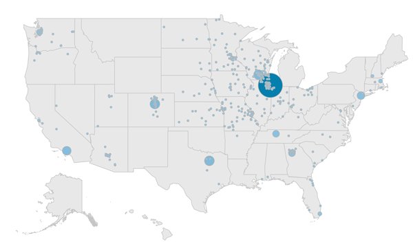
With 83% (Update: after the pandemic this number hit 100% at one point) of enterprise residing outside of headquarters physical location, the communications team was challenged with producing an informative, consistent, and transparent messaging platform that enganged it's users in a meaningful way. In addition, there were a mulitude of competing platforms that diverted the attention of readers. This diversion of attention caused confusion, made tasks harder to accomplish, and increased enterprise expenses. Solving these communication problems was critical for enterprise as all of this factors impacted our customers.
To give everyone a stronger sense of belonging to one company, we needed a platform that could be the central source for news, announcements and events. Additionally, to keep everyone connected, we needed to build a strategy to ensure our audience used Compass as a tool to find their web-based tools and share relevant content within their internal and external (if applicable) networks.
Discovery
Balancing desirability, feasibility, and viability through research. In order to accomplish our goal we would need to better understand our current users, the capabilities of our developers, and the needs of the communications team.
Understanding the desires of our users
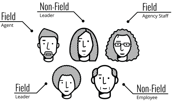
To begin, we conducted listening sessions to help create user groups based on audience motivations, feelings, pain-points and goals. Through research, we discovered:
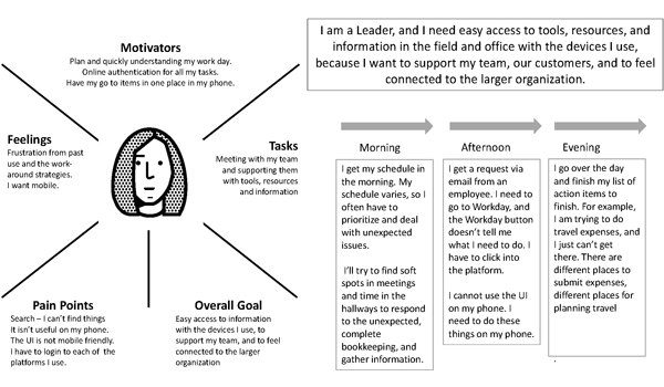
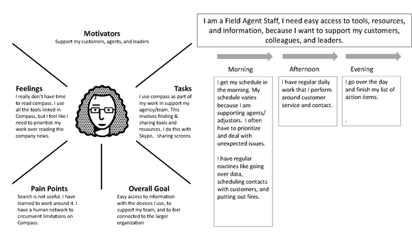
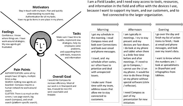
- Leaders need easy access to information. Creating experiences with their devices in mind was crucial to support their team and customers faster.
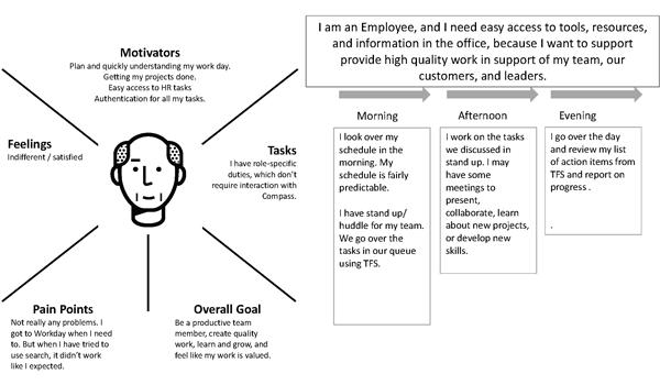
- Employees need access to tools and resources to support expectations. They have a strong desire to be productive, create quality work and feel valued.
- Sales leaders want to support agents who get frustrated with technology issues. Thus, updates without work-around strategies are valuable to them.
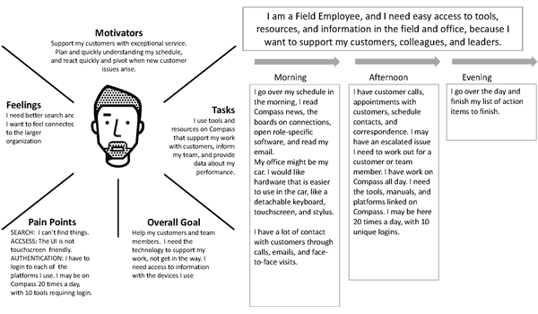
- Agents need to support their customers with exceptional service. They need to understand their schedule and pivot when customer issues arise.
- To support agents and customers, agency staff rely on the availability of tools and resources. At times, due to work volume, they don’t have time to interact with Compass and want a streamlined experience.
Based on the findings, we established a strategic foundation to create features that would accommodate each user’s needs to help them perform their responsibilities. We found:
- That our power users were often leaders with experience and institutional knowledge. They desired a configurable dashboard that they could share with their teams.
- That general users wanted to create their own containers to ease content access.
- That a responsive site was a mandatory requirement for a majority of users as content consumption was preferred to be completed on a personal device.
We also exposed behavioral intent throughout our interviews that could be used to reach our audience at different times in different ways.
We also learned:
- Search had to work without having to go to three different search engine to find content. We could no loger rely on experienced users, whom had their own search strategies, be the bottle neck to important information.
- One-step authentication - Some users had 3-11 unique sign-ins that could take 30 seconds to complete each one multiple times a day. Lose of a password could take anywhere between minutes to several hours.
Understanding feasability of our developers
We also need to meet the needs of our business stakeholders timelines by leveraging our existing brand style guides and component/pattern libraries. By doing so, we estimated that 65% of the existing UI elements and components from other digital efforts could be reused. This gave the developers a solid starting point and base knowledge of how the front-end could be built on a new platform. Recycling this work also allowed us to explore designs that delivered proven engagement while being mindful of budget.
Understanding what was viabile for our business
Our communications team was looking to accomplish a lot with this project, but still had constraints with time and budget. We needed to move the majority of non-standard communications sites to the new platform (Sitecore). This meant demonstrating the value of this effort to business stakeholders and that the approach was a viable solution for their needs.
We held frequent sessions with leaders, subject matter experts, and development to mark our direction, pivots, and progress.
Overall
We conducted the following studies, empower developers, and convince business stakeholders that we were heading in the right direction.
- Phase 0 (Business Needs)
- Analyzed results from survey (1248 responses)
- Comparative analysis with five established corporate intranets
- Empathy interviews (Agent & Staff (21), Sales (15), Corp. Leaders (19), Employees (25), and Contingent (4))
- Rapid Iterative Testing and Evaluation
- Phase 1 (Feasability needs)
- Feedback-Driven Concept Refinement
- Feedback-Driven Acceptance Testing
Ideation
Divergently thinking about the different possiblities of our future communications needs of our people.
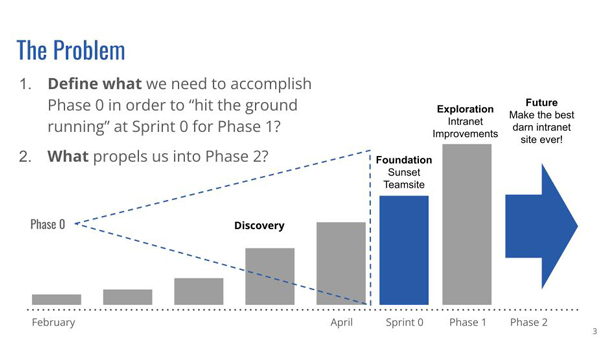
Addressing content and navigation concerns
The previous intranet (Compass) homepage for employees had inconsistent functionality that negatively impacted productivity. Moreover, the navigation was not intuitive, search results were unreliable and no consistent information architecture or standard were used. The intranet (Field Compass) homepage for agents didn't match the user’s mental models of modern digital experiences.
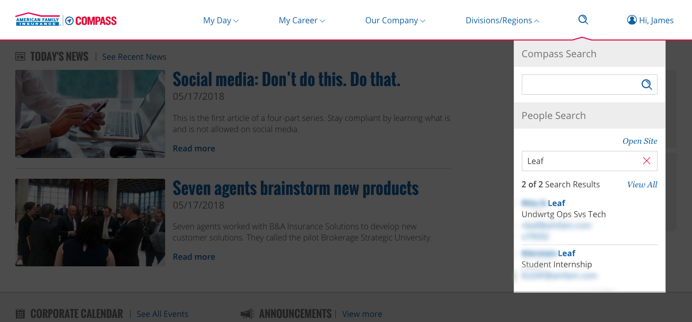
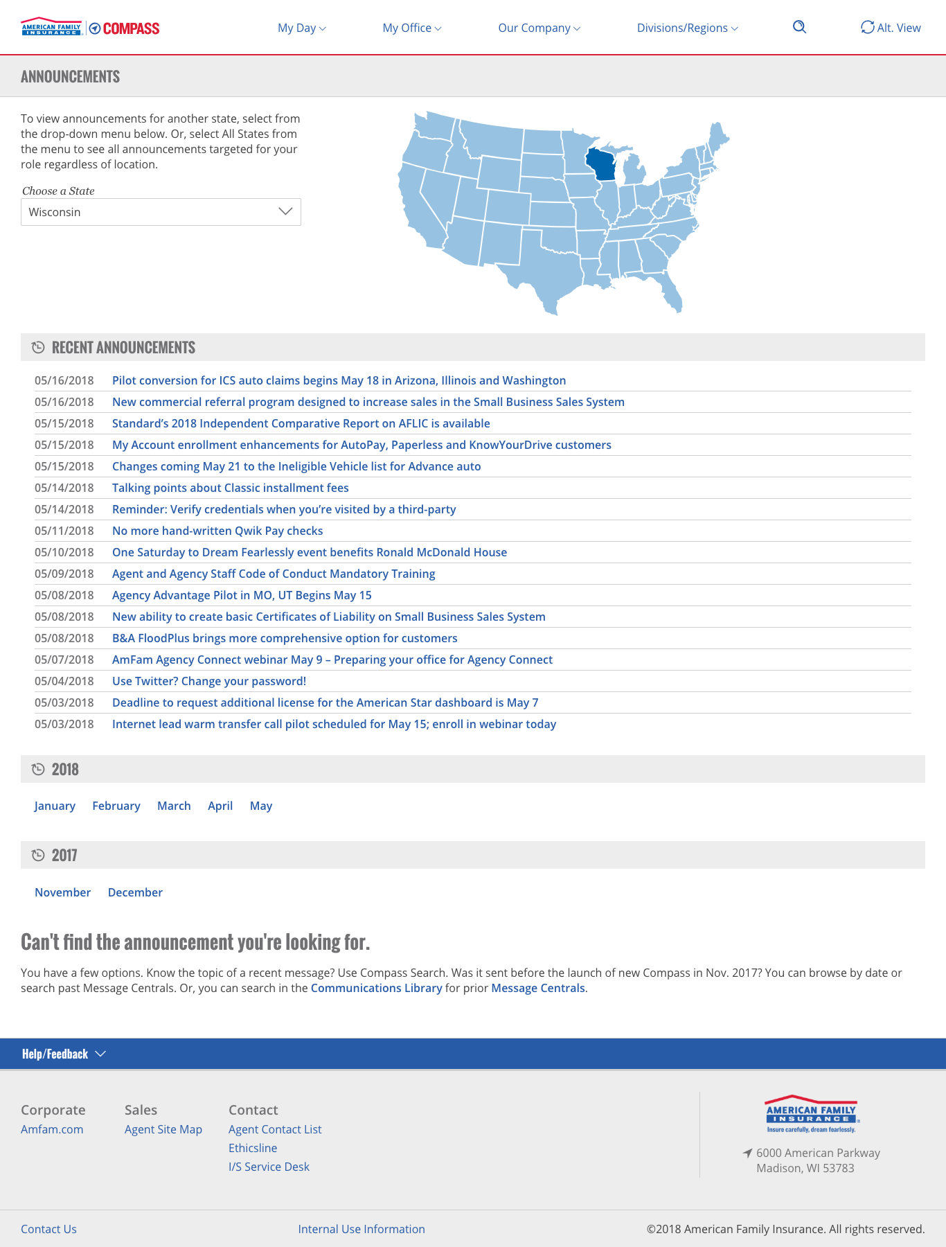
So we introduced a personalized global navigation system that was action-oriented, allowing the employee audience complete their jobs efficiently. Decisions for rebuilding the global navigation were based on frequency of use, metrics and best practices. The personalized global navigation targets by role, location or individual preferences.
So we explored new opportunities for users to consume information. For instance, during the listening sessions we learned most users valued announcement headlines. We placed this content in expanding blocks for quick access. Additionally, we learned that users felt behind when returning from vacation. Upon return, most would rely on email and other channels to catch up. Because of this concern, we created a single area, which allows users to consume the last 30 days of content.
Previously, site controls were inconsistently placed in throughout the intranet. The new utility menu captures these site controls allowing users standardized access throughout Compass.
Experimentation
Confirming personalization desires while validating business concerns
We choose to build a tool to better understand the models users had around their content organization needs. This method of testing is similar to typical usability studies in that participants are asked to complete tasks using think-aloud protocol. This version, however, allowed participants to create their very own designs based on what we were discussing at the time. We could add constaints or make it free-form based on our questions.
So instead of waiting until the end of the design, we could quickly gather feedback. With this feedback, we could quickly validate our designs assumptions or get feedback on new solutions.
In addition to helping users consume content, we explored ways for users to customize their digital space. For instance, a majority of users bookmarked important links within their browser. Therefore, we created a place for users to access their links on any device or browser and display their favorite links on the home page.
Design Considerations
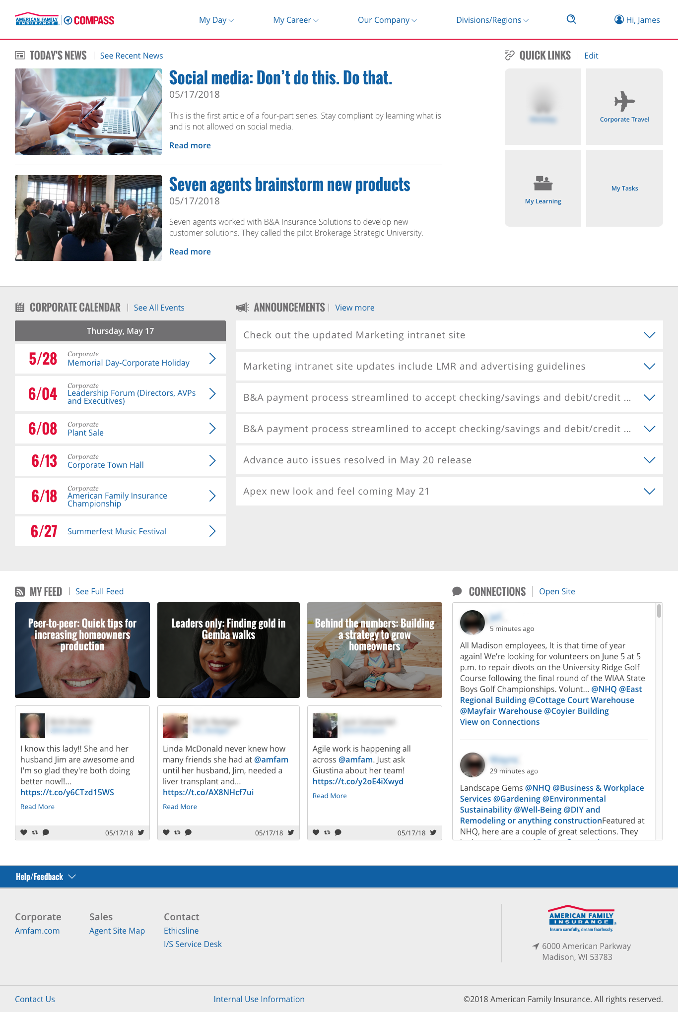
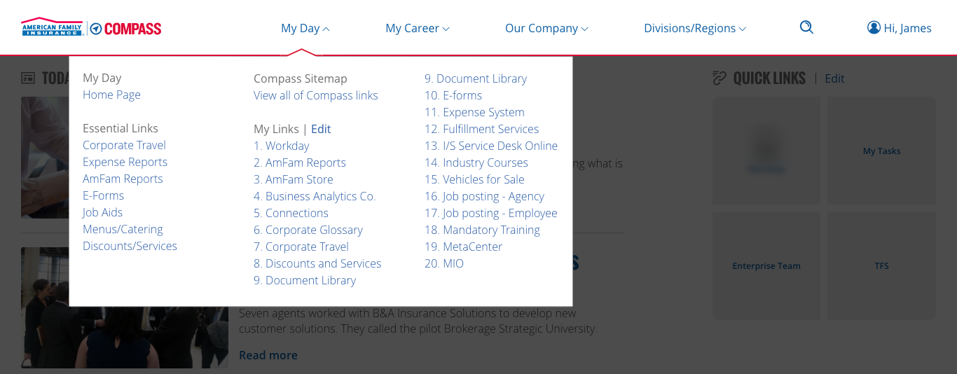
Updated homepage - The home page consolidated functionality for all audiences based on company and role to deliver a consitent personalized content. The first section, My Day, was designed to help users locate what they need in order to do their job. It featured today’s news, four quick links, a calendar, and announcements. The second section, My Feed, helped users keep up-to-date with news.
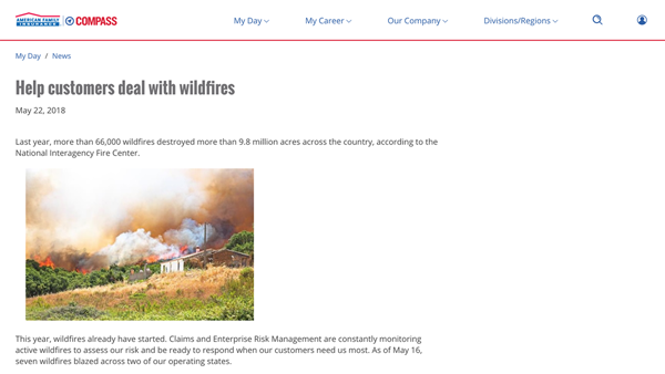
Article improvements - We strengthened our article content by moving to shorter, easy-to-scan responsive layouts; while improving our visual storytelling through infographics, photos and video. We placed an emphasis on social and user-generated content, to further connect and share with an external audience.
Consolidated corporate messaging – We consolidated multiple communication tools into one. Allowing content authors, a place to efficiently deliver targeted information to users. Another notable improvement is these announcements are indexed for improved searchability.
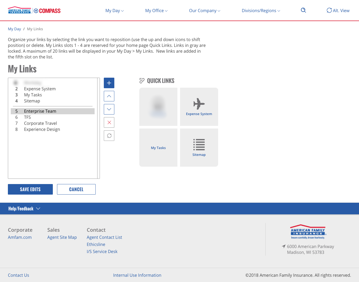
Persistent favorites - Users can select from a personalized list of links or create their own. The top four links are then listed on their home page thus customizing the platform to be relevant to their jobs and interests.
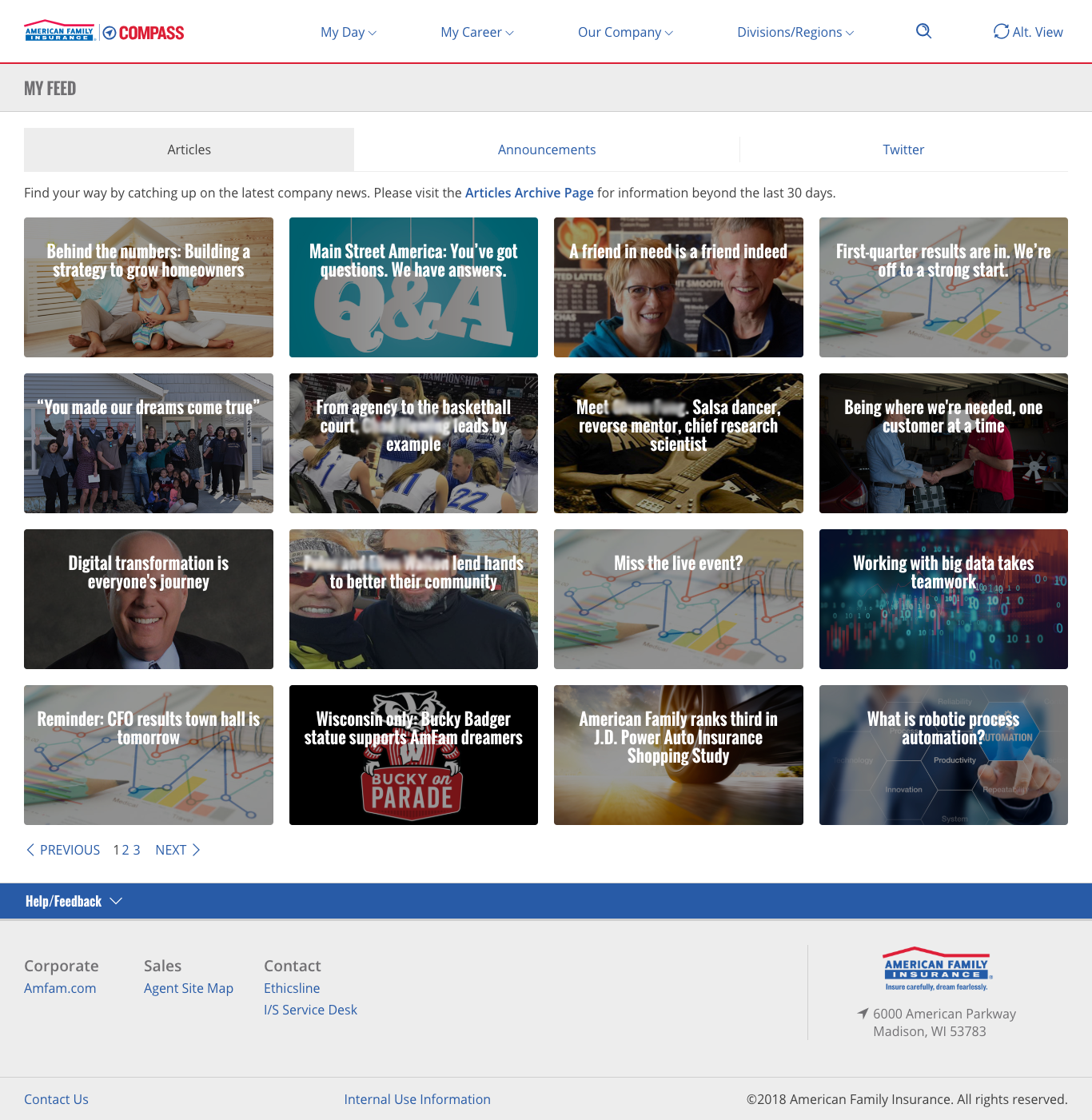
Personalized RSS Feed - From one location, My Feed lets users see previously released news articles, announcements and social posts (Twitter and Connections). It’s the place to catch up if individuals have been away from of the office.
Improved content search - Users will benefit from divisional content placed within the platform, since it integrates with the new search strategy.
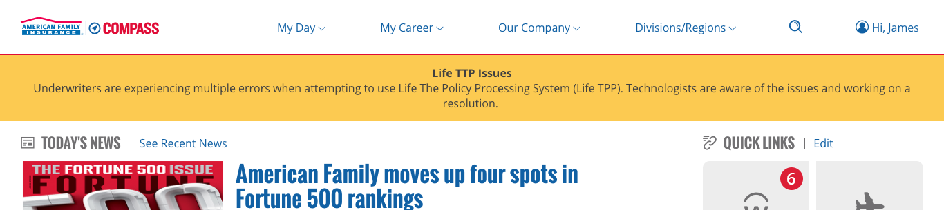
Alerts and notifications - Users can easily find alerts and other notifications in the platform with banners and counters visible on various features.
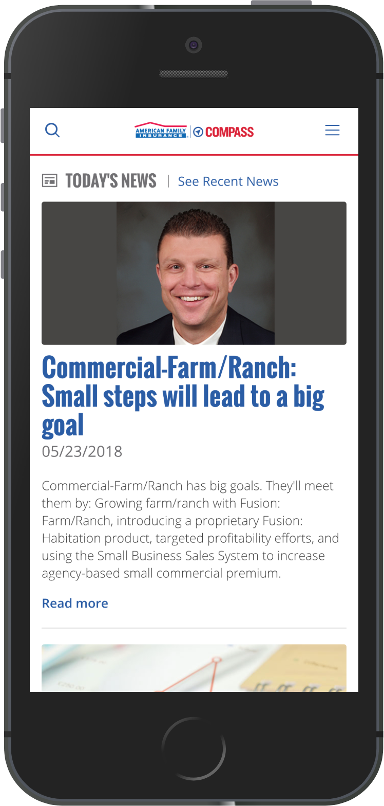
Compass portability - The platform was designed with mobile-first in mind to accommodate multiple form factors.
The end result
Finally, we built and tested the new features. As a result, the platform created tangible impacts on engagement and productivity. Today we continue to learn and refine the platform.
- We personalized the user experience by making our navigation, utilities and content specific to individual user’s needs.
- We’re able to adjust users content by identifying their role, location and division.
- We introduced customization to the homepage by giving the users control to manage their own set of links. This feature is the first step in addressing insights gained from our research.
- We improved the ability to search and find content like announcements. We accomplished this by indexing the announcements within Compass.
- We made it possible for users to quickly discover what they may have missed while busy or out of the office. We integrated notifications from other systems to inform users about external items.