Quick and "Dirty" Research Methods
User Experience Research, Prototyping, and Design
From 2013 to 2015, I was the sole User Experience Designer at Johnson Health Tech (a multinational company engaged in manufacturing and selling exercise equipment). I led user-centered design efforts with cross-functional engineering, sales, and marketing teams. I also coordinated with the innovation areas to bring a diversity of thought and expertise. We produced world-class creative solutions from concept to launch for marketing sites, consoles, and other digital experiences
Case study: Paper prototyping with finger paint
We were looking to explore the usability of speed and incline adjustment for consumers interacting with our 2015 Vision products. We knew a complete research study wasn't in scope due to a constrained budget and timeline, so we decided paper prototyping was the best way to validate our hypotheses.
We knew paper prototyping was the direction, but we didn't know how to see where people were pressing while running on a treadmill. We used divergent to explore possible solutions. Double-sided tape on the finger? Ink? Water? Toothpaste?
Finally, we landed on a solution! Wasn't it fun as a kid to use finger paints? It's easy to clean up, easy to apply, and comes in a range of amazingly bright colors! It was time to cut down some cardboard, tape our layouts over existing consoles, and recruitment of some unique fitness enthusiasts to help us out.
Experimentation
First, we created a script and ranking system for our study. Our script was a simple way for our volunteer researchers (study buddy) to follow so we could a measurable test with our participants.
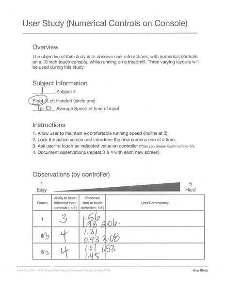
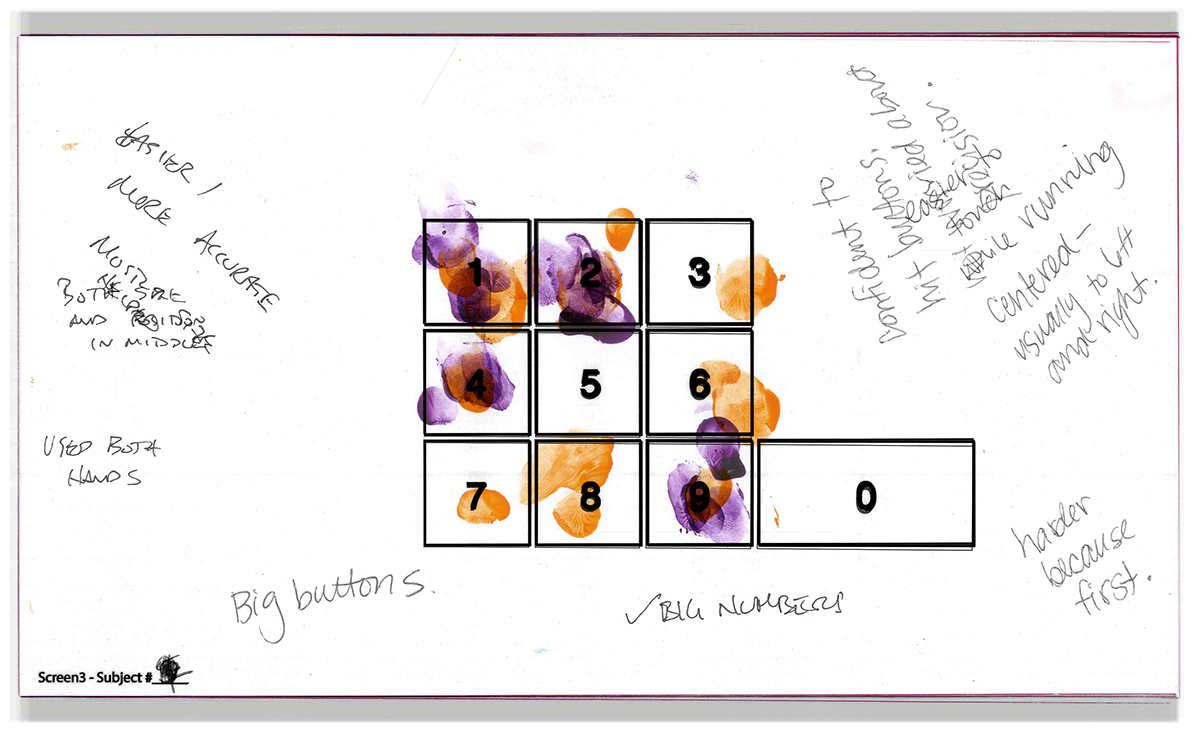
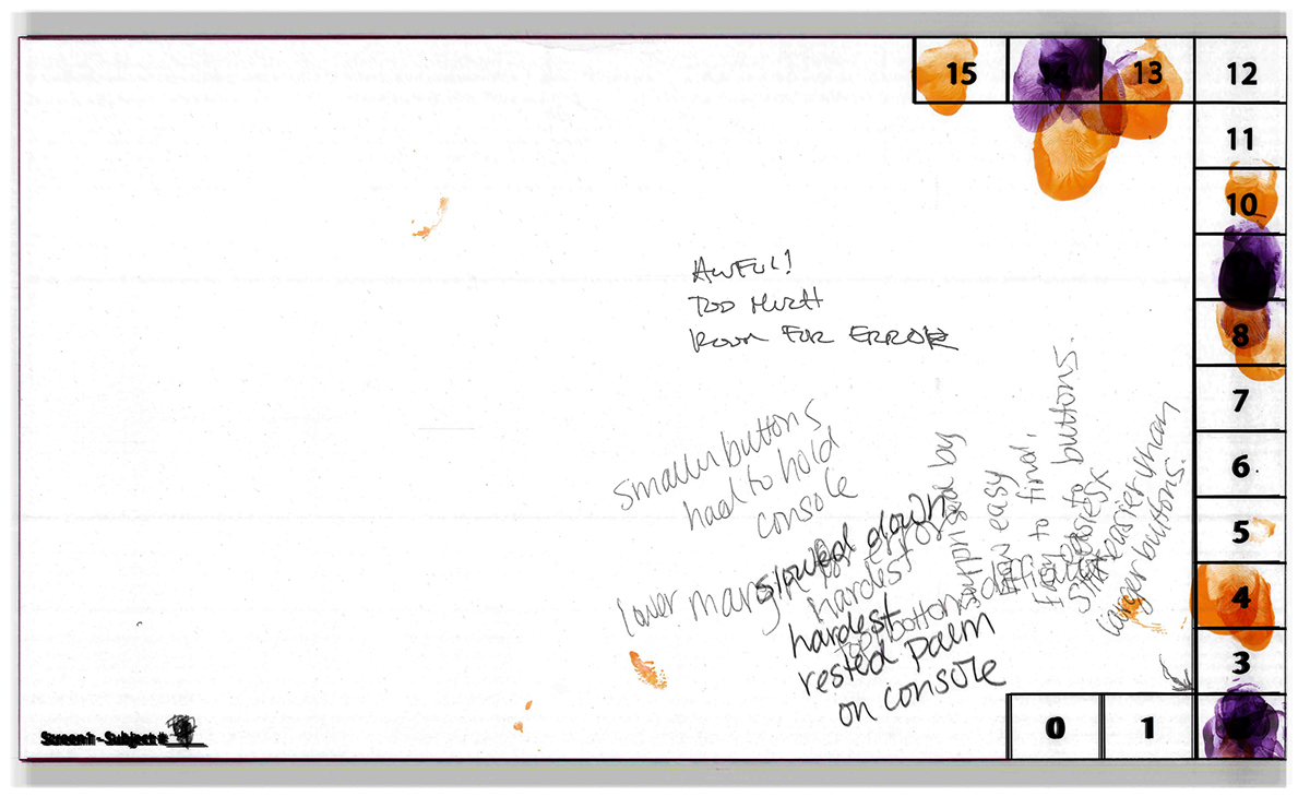
Next, we were ready for our study. We gathered our participants next to a treadmill and paired them with a study buddy. We then instructed each research participant to maintain a comfortable running speed on the treadmill and wait for their buddy's cues. For safety, each buddy locked the screen behind the paper prototype to ensure safety. They then presented each paper prototype layout to the console and asked the user to touch a predetermined value on the console. The participants would then use their fingers to "paint" their interaction.
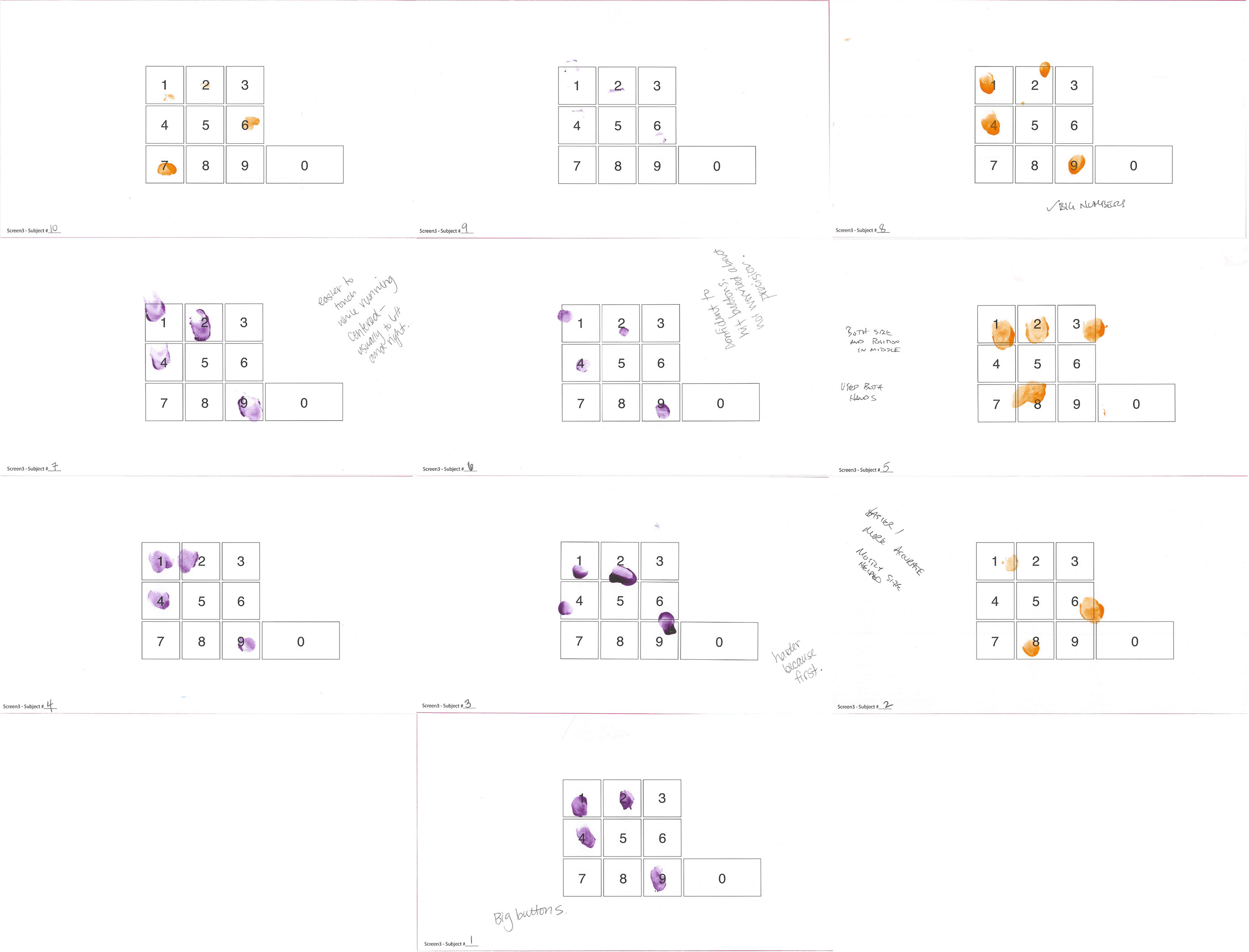
We documented the observations from each participant and included their remarks. We then overlay each layout type to create a visual to react to and converse upon.
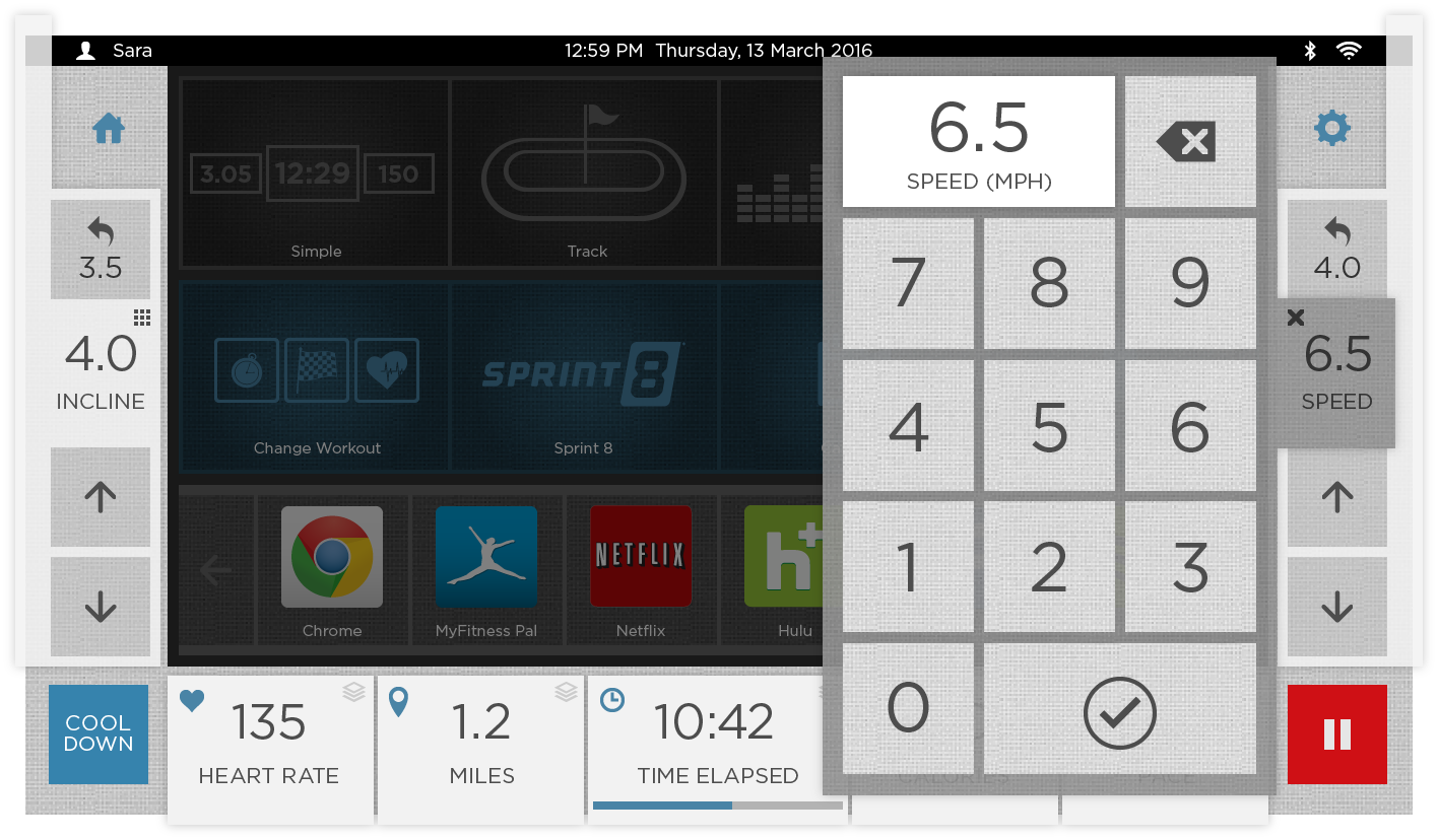
Layout 1
The layout was a new concept. It incorporates approaches outlined in Fitt's Law (learn more here). The closer and more extensive a target is, the faster it is to click on the target. This was the most significant diversion from what we are currently doing with speed and incline control on our consoles, and I think it forced people out of their comfort zone and into a place to give excellent feedback.
Some of the things we observed/heard:- While it was hypothesized that placing the buttons on the edge of the screen would effectively make them infinite (the control extends to the edge and beyond), participants felt that they needed a higher level of dexterity and precision to press these buttons than with the other options. This resulted in participants placing their hand on the console for stability before pressing the buttons - and undesirable action.
- Content in the corners felt crowded and took longer to access.
- Participants liked the "quick keys," and the controls are always there (not hidden, which would require another touch).
- Buttons at the top were further away due to the angle of the console and, therefore, harder to hit accurately.
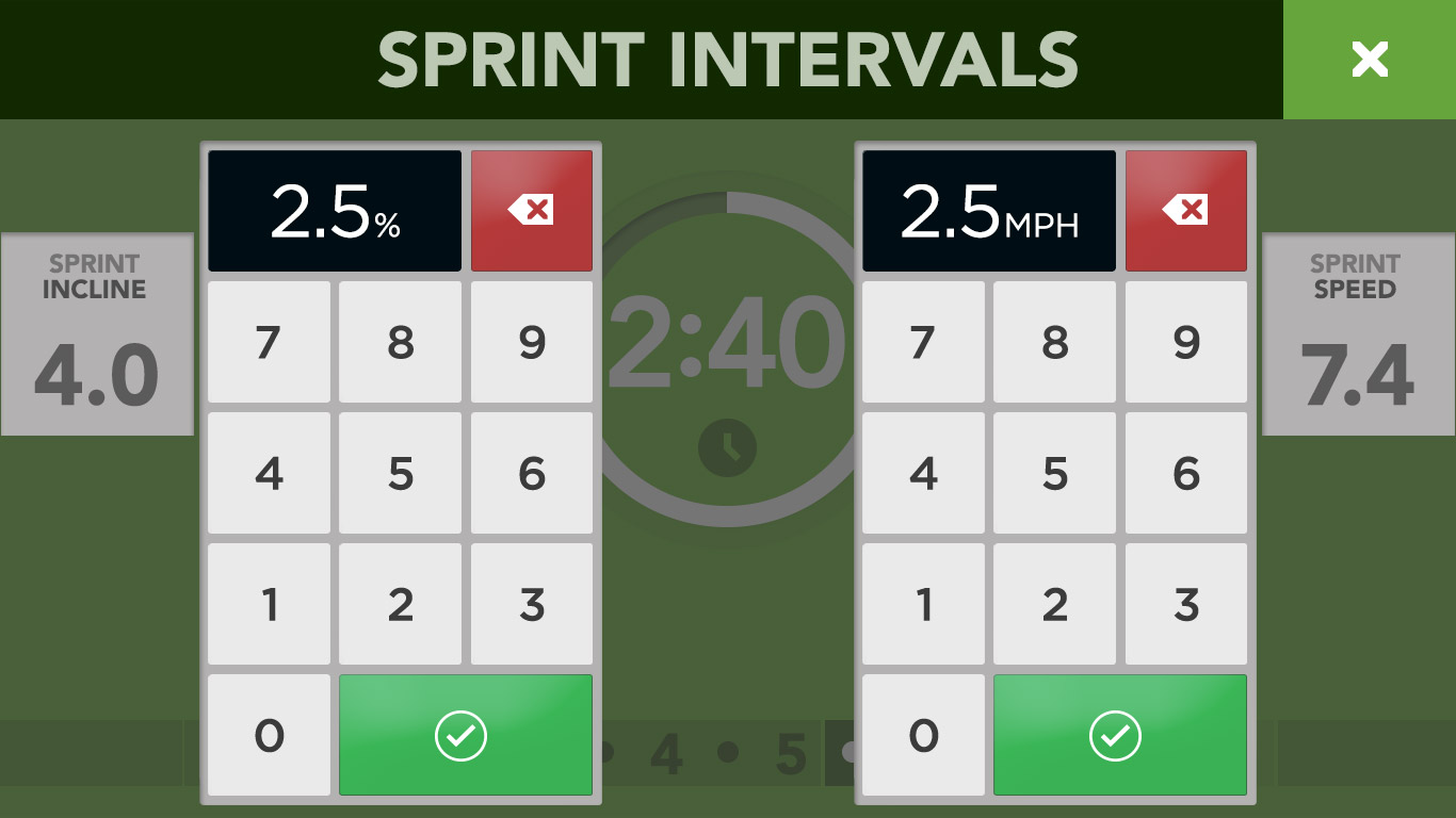
Layout 2
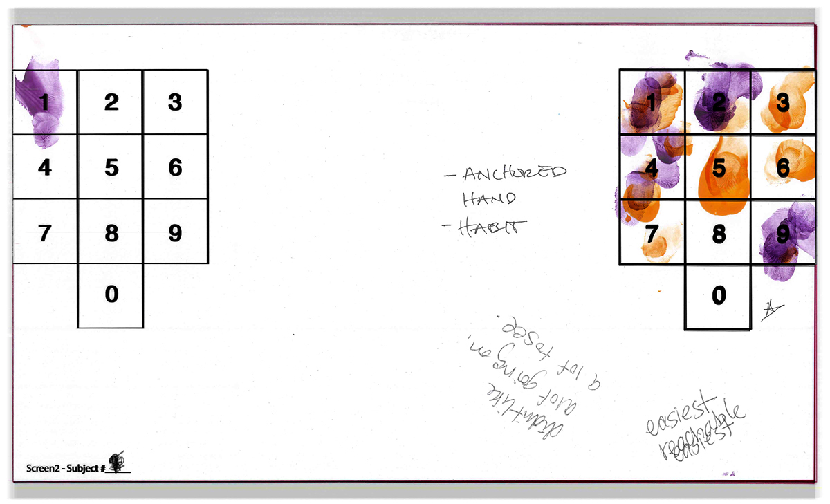
The second layout was a keypad option similar to what is currently used on Matrix products.
Some of the things we observed/heard:- The design was very familiar to the participants we tested and was well-liked because it felt normal.
- Overall, precision was best with this design.
Layout 3
The third layout was another keypad option but had larger buttons and was placed in the middle of the screen.
Some of the things we observed/heard:- Participants responded favorably to the larger button size and found the design to be very straightforward to use.
- Some participants are conditioned to the speed and incline to be on the sides of the screen and prefer that layout over the centered design
- Participants did more "poking" with the tip of their finger on this screen, rather than "pressing" with the pad of their finger as with the other designs.
Findings and next steps
Overall, the study was a huge success. Participants were smiling and having a good time while helping us explore new ideas. This was only the tip of the iceberg as far as user research was concerned.
The findings told us we were heading in the right direction. The lessons we learned helped us determine a design direction that would likely incorporate the well-liked aspects of each approach. They also informed future projects as shown in the examples below: